
Mirror was (fictionally) founded in 1994 as a clothing store targeting a budget-minded audience who looked for low-cost clothing for every occasion.They believe clothing doesn’t have to be expensive and we should be able to change styles as we need and please. Mirror is very successful offline, offering over 400 stores around the world in 32 countries. Customers have been asking for an online shop for years, and Mirror is finally committed to to achieve this.
How can we differentiate Mirror from its competitors, while keeping the experience easy and familiar in the user’s point of view?
Design a responsive website that allows a diverse group of users to easily find and purchase clothing for all occasions. Site and logo should feel clean, modern, and neutral.
For user research, I spoke with 7 individuals ages 20-29 that varied from shopping exclusively online, to rarely ever doing so.


The goal was to keep this map as simple and straightforward as possible. The less the user has to think about their choices, the easier it will feel to use and interact with.

Creating a flow to show the process of a user searching for a product, and completing a purchase.

The site map and task flows were used as reference to determine which screens to create.


Mirror described their brand message as:


The source of truth, and reference point for all design decisions.

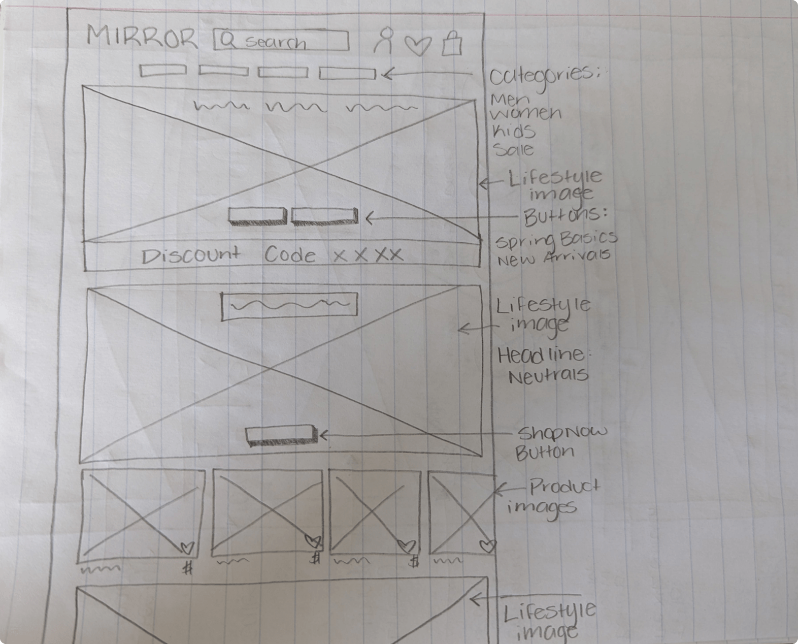
After completion of the UI kit, I applied colors, branding, and images to the mid-fidelity wireframes to bring Mirror to life.

.jpg)

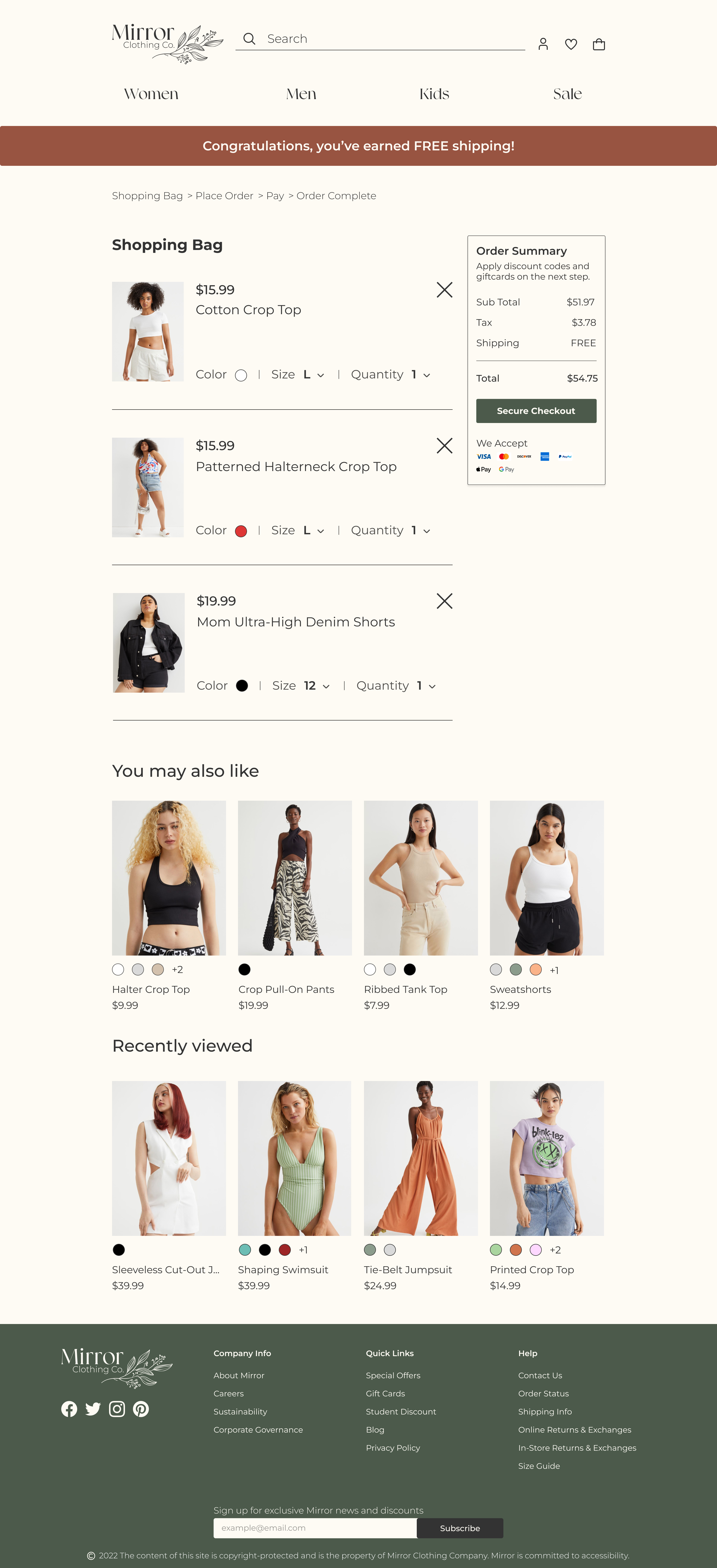
With the high-fidelity wireframes completed, it was time to test my assumptions in the form of usability testing. Testing was completed both in-person and virtually with four users.


Taking user feedback into account, I implemented suggestions for wants, needs, and preferences. The majority of concerns were minor issues concerning sizing or spacing of elements to improve usability and visual appeal.


In conclusion, my prototype was a success. All participants were able to complete all tasks without hesitation. Users knew where to look for items, and were delighted to see features that had been mentioned during the research phase. Participants noted that the site felt trustworthy and encapsulated a modern, carefree lifestyle.
This project was completed with limited time and resources. In the future, I would love to be able to conduct research and testing with a larger, more diverse group of individuals. User testing could be more in depth, allowing for testing of more features and tasks. With more testing, further versions of the project could be completed and continuous iteration could be utilized.
